Volodymyr Riabchuk
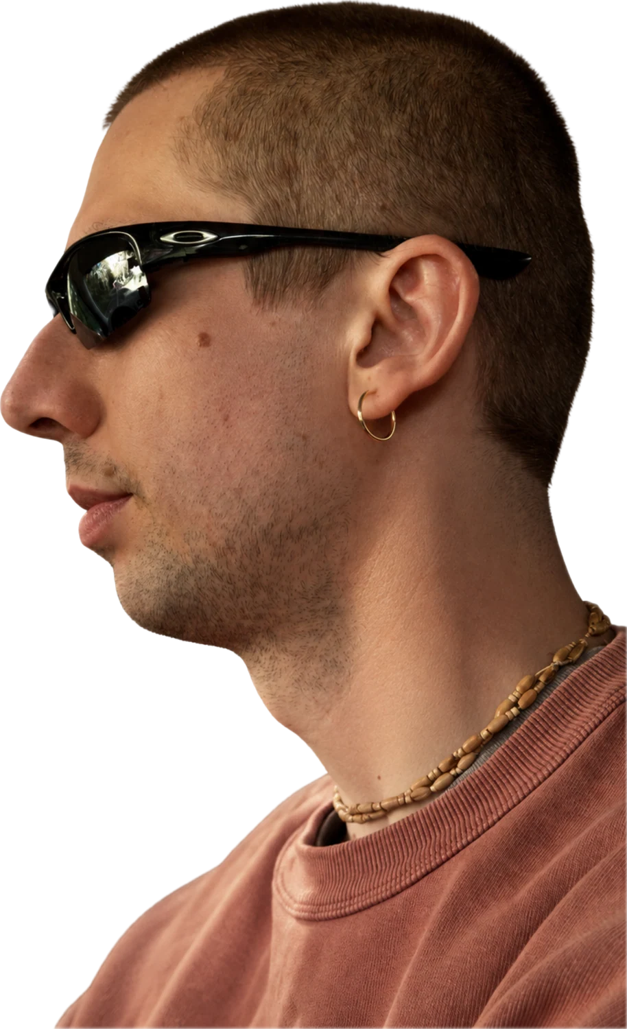
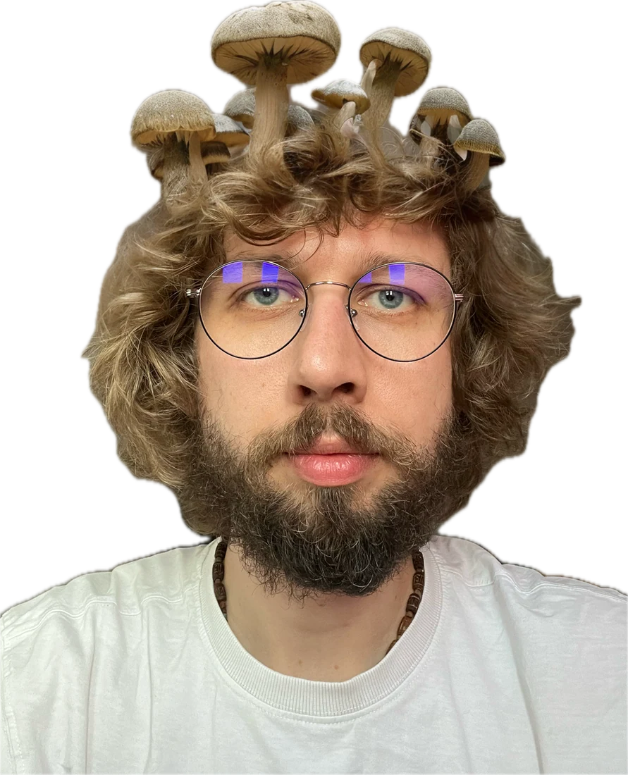
Graphic designer and visual creator in Ireland. Fifteen years of brand systems, social, 3D, motion, AR and decks.
One designer, several visual languages.
Most briefs need more than a picture. They need a language that survives across a feed, a pack, a deck and a filter, and that other people can keep using after you leave.
Brand systems and identity
Logo concepts, brand books, colour and type rules, applications that hold up without a designer in the room.
Social systems
Carousels, stories and reels built as one system with seasonal rules, not as a pile of separate posts.

3D and product visuals
Cinema 4D modelling and rendering for packs, bottles and staged product scenes that replace part of a photoshoot.
Motion loops
Short, seamless animation made for a feed, where the idea has to land in about two seconds.

AR filters, decks and AI assisted visuals
Face filters for brand campaigns, franchise and pitch presentations, and generative imagery folded into a controlled visual system.
Selected work.
A curated selection from fifteen years, mostly inside agency production. Each case is a small part of a longer collaboration, and each one can be expanded with the brief, constraints, process and results.
Prosto Nashe
After the brand changed its name, its feed had to explain who it now was. I shaped the visual code from the earliest posts: the three blue stripes, the blue and white palette, packaging cues, and a warm domestic tone that reads as Ukrainian without costume.
Two years is too long for a set of nice posts. It needed rules other people could follow: how a recipe card is built, how a holiday is treated, how a new product enters the feed without breaking it.
- Built the visual code: stripes, palette, packaging cues, photography direction
- Wrote seasonal mini guidelines for Easter, winter, Kolodiy and the lactose free launch
- Designed carousels, stories, reels and AI assisted visuals inside one system
- Kept the product recognisable while the feed changed with the season


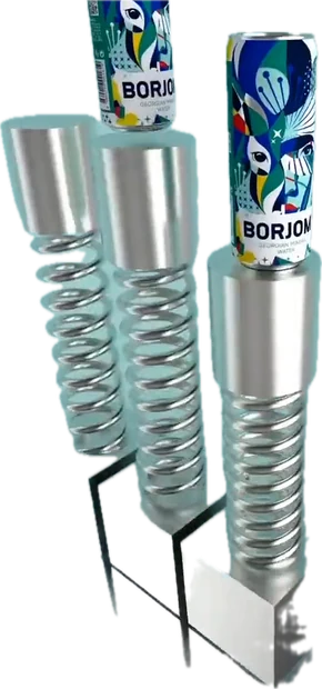
Borjomi has a strong character and one very recognisable object: the bottle. Across several years of feeds, campaigns and holidays I grew into Cinema 4D here, modelling bottles and cans, rendering overnight, and building seamless loops that could carry a joke, a promotion or a product message.
The discipline of a long running brand is that every frame still has to feel like Borjomi. The freedom is in what you are allowed to do with the object once it does.
- Modelled and rendered bottles and cans in Cinema 4D
- Built seamless motion loops sized for social feeds
- Made campaign key visuals, including the character led campaign
- Produced holiday, giveaway and promotional content across formats


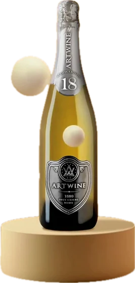
I do not drink alcohol, which turned this into a purely visual problem, and that is exactly why I enjoyed it. The bottle is a hero object: glass, light, reflection, a small stage, and an atmosphere of celebration around it.
The job was to make a sparkling wine feel premium and playful at the same time, on a phone, in about two seconds.
- Modelled and lit bottle scenes in Cinema 4D: neon frames, balloon rooms, podiums
- Built looping product animations for stories and posts
- Designed seasonal and colour led editions, including a Pantone colour of the year post
- Delivered static key visuals from the same 3D scenes
Drag or scroll sideways for more from this world.
AVK is from my home city, so this one carries something personal. Confectionery has an honest job: make someone want it inside the first second, before they have read a word.
Everything is built around appetite and clarity. The product is the hero, the movement is short, and the colour does the shouting.
- Modelled and animated packs and products in 3D
- Built short loops tuned for a fast scrolling feed
- Produced static key visuals and seasonal product posts
- Kept pack legibility intact at small sizes and in motion

Drag or scroll sideways.
Amway Artistry and g&h
Beauty content is judged on precision. Air, rhythm, hierarchy, and a product that looks exactly like itself.
These are stories and carousels built for the phone: one idea per screen, ingredients and benefits legible at thumb distance, and a calm surface that a global brand can sign off without a fight.
- Designed story and carousel systems for product launches
- Set the layout rules: one message per screen, consistent type and spacing
- Adapted a global brand book to local campaigns and seasonal launches
- Built explainer layouts for ingredients, benefits and usage
Everything here is designed to be understood at arm's length, on a screen the size of a hand, while someone is moving.


Drag or scroll sideways.
Amway Nutrilite
Where beauty content sells a feeling, wellness content has to earn trust. The voice here is more rational: heritage, farms, evidence and benefits, explained calmly.
I treated the ninety year history of the brand as an editorial timeline, then carried the same green, documentary tone into everyday habit content.
- Designed a heritage timeline carousel from archive photography
- Built a green editorial system for farm and sourcing stories
- Produced explainer content on supplements and daily habits
- Kept one typographic and colour system across launches


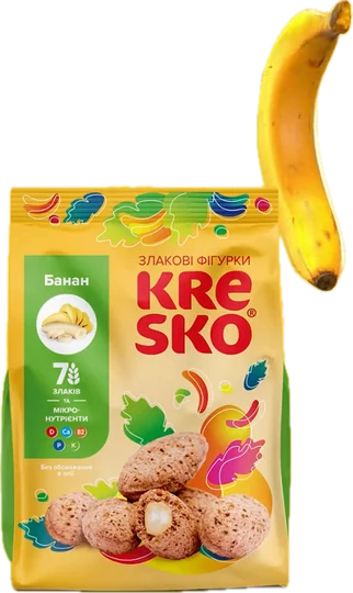
Packaging and product visuals modelled and rendered in Cinema 4D, then finished in Photoshop. Built this way, 3D replaces part of a photoshoot: you can rotate the pack, relight it, drop it into a new environment and reuse it all season.
One of these packs exists in the real world. I designed it in Ukraine, and years later found it on a shelf in Ireland.
- Modelled packs and products in 3D and rendered them for print and social
- Designed pack graphics that survive the move between render and shelf
- Built staged product scenes that replace parts of a photoshoot
- Produced reusable seasonal and promotional visuals from one 3D set

The pack as I designed it.

The same pack, found on a shelf.


I volunteered with Food For Life in Donetsk, later in Kyiv, and now in Ireland: cooking and handing out meals for people who need them. When the Dublin team needed an identity, they asked me.
This is the case where the work moves past daily social design into identity: a logo concept, clear space and colour rules, applications, posters and merchandise that volunteers can actually use without a designer in the room.
- Developed the logo concept and its variations
- Wrote the brand guidelines: clear space, exclusion zones, colour and logo use
- Designed posters and information materials for food distribution in Dublin
- Applied the identity to merchandise and volunteer clothing


An AR filter is the moment graphic design becomes something a person wears. It also comes with hard constraints: the face is moving, the phone is weak, and the idea has to read in about a second.
These were built as branded, shareable ideas rather than decoration, with the brand present but never in the way of the person using it.
- Developed filter concepts tied to brand campaigns
- Designed the assets for face tracking and platform limits
- Built game and reward mechanics into shareable story filters
- Delivered demo material for brand accounts
A presentation is a visual scenario. Structure, the order of the arguments, where the number lands, and what the reader understands in the first three seconds.
Each of these businesses needed its own identity inside the deck rather than a template. MOST Franchising Day was a multi screen presentation in Kyiv that had to carry many different franchise concepts at once, each with its own visual system, without the evening falling apart visually.
- Built deck structure and dramaturgy alongside the client
- Designed a distinct visual system per business, not a shared template
- Turned business models and numbers into readable layouts
- Delivered multi screen presentations for a live event


Jack & Jill Charity Boutiques
My first local work in Ireland, through the TUS programme in a charity boutique. Alongside the shop floor I proposed a social content approach for the store: a carousel concept built around before and after, clearer product storytelling, and a warmer way to show second hand items.
Not all of it was implemented, and I still count it. It is initiative, local context, and design applied to a real community environment while I was learning how retail works here.
- Proposed an Instagram carousel concept for the boutique
- Restructured how donated items are photographed and presented
- Wrote the content plan around a before and after mechanic
- Worked on the shop floor with customers while doing it


Cultural and personal work
Work I take on because the subject matters to me. Event identity, posters, maps and announcements for cultural and community events, where a poster has to carry an atmosphere and a start time at the same time.
Meta Veda is the freest of them: a performative mantra jam where the visuals could go somewhere quieter and stranger than commercial work usually allows.
- Designed poster series and announcement visuals for events
- Built AI assisted imagery into a consistent editorial look
- Produced practical materials such as route maps and flyers
- Kept one visual language across a series of dates


I like projects where design does not stop at a picture.
Most of my career was inside agency production: briefs, brainstorms, copywriting, art direction, social systems, 3D, motion, AR, presentations and AI assisted visuals. I started as a copywriter, which is probably why I still begin with the idea and the words before the layout.
I am strongest when the task is not to make one thing look good, but to decide how a brand behaves across posts, stories, reels, packaging, decks and filters, and then write it down so it keeps working without me.
- Copywriter, Designer, Creative Director2013 - 2023Inversia Agency (ex elvisPelvis), Ukraine
- Visual designer and presentation specialist2020 - 2022KRASIVO Group, Ukraine
- Layout designer2012 - 2013Publishing House Edit, Ukraine
- Content and visual support2025 - 2026Jack & Jill Charity Boutique, Ireland
- Volunteer, design and community supportongoingFood For Life, Ukraine and Ireland